Custom Power Map to show Mick Jagger’s stage presence during Gimme Shelter

This article will show you how you can use that nobody’s child called Power Map or 3D Map to solve a problem many of us wish to run into one day. We get tickets for the Rolling Stones and are unable to decide where to set up camp, to be closest to Mick Jagger. That seems like an every day problem right J.
First we must do our research. For that research to make any sense one should go through a lot more video material, but as a proof of concept, I choose one song (Gimme Shelter)…
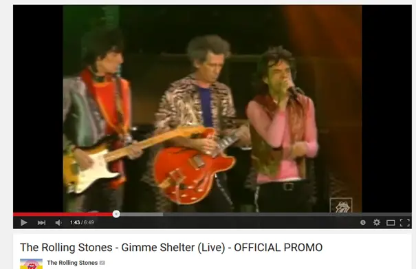
…from the Bridges To Babylon tour, that also features a spectacular performance by singer Lisa Fischer (another statistical mistake since Mick only looks at her and stands still for about 40 seconds). Now I choose Mick Jagger cause he just can’t stand still when he’s on stage and I’m guessing only Freddy or Axl would have a more diverse chart, but even here, when Lisa is singing, that’s when you see Mick standing still. You can view the video I was working from here:
https://www.youtube.com/watch?v=8kl6q_9qZOs
Next up, I took the stage from that tour and decided on the granulation of positions I wanted to make. The whole thing was just in 1D to me, but I could have included the Y axis data to create an even more comprehensive chart but the Video was not Offering enough data so I decided to work only with the X axis.

So I created a gridline that carved the stage into 32 pieces. Also decided that rather than going from 0 to 32 I would set the 0 at his microphone stand and went 16 off in both directions.
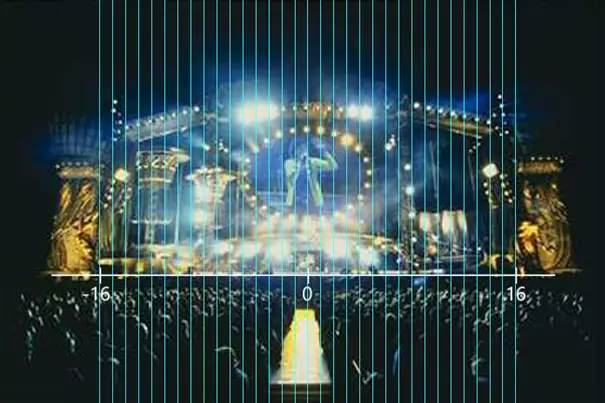
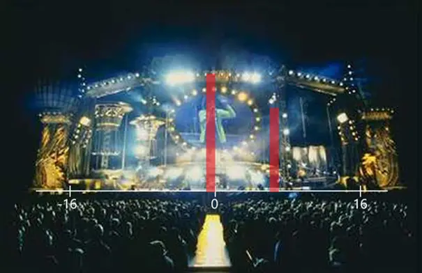
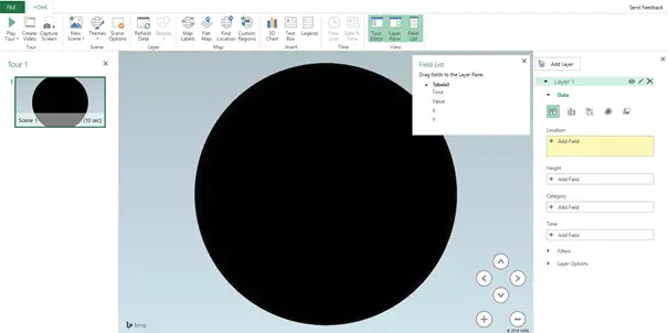
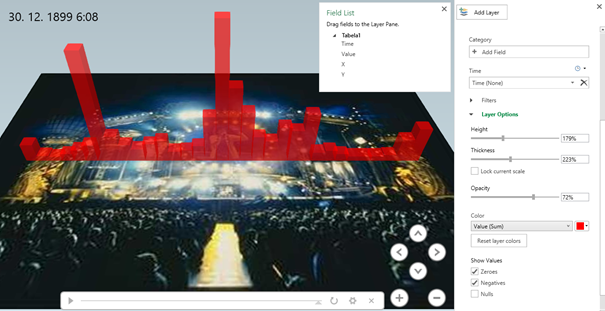
Now to get something like the picture bellow
Serious data gathering had to take place. So I fired up Excel and started analyzing the video in this new light. Did a simple table that only had Time, X, Y (which was 0 at all times) and a simple formula that calculated the relative time that he spent at that position.
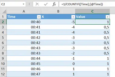
The whole process took forever and at certain points was more or less a guess, but never the less, I gathered all the data from 0:40 of the video (first sighting of Jagger) and up to 6:08 when the song (at least the singing parts) ends.
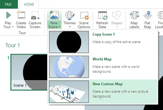
And from there to Insert/3D Map/Open 3D Maps.

When I saw this picture I thought of the dark side of the moon but quickly realized that it was not night time in the picture it was just that no geo-location data was available in my dataset.
Solved that quickly with the New Scene/New Custom Map Command.
Set the X and Y limits where I took into account that the picture of a stage went beyond the limits of movement on so I added those four in both directions. I only needed the 0 on the Y axis.
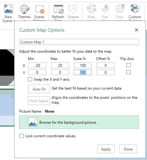
Then set the background picture as the Image of the stage that I was working with.

Next up, I started adding the Fields from my Table starting with the Location or the X and Y coordinates.
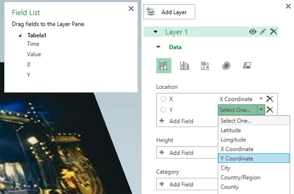
Next up choose the Value column for Height and the Time Column as my Play in Time Axis.

With this the stage was set (get it J ) to start setting up the scene. Whereas I had about 5 minutes and 28 seconds of data, I set the speed of the charting to 60 seconds. So about 5 times faster than real. Took Dooly as the Effect (I still don’t know what it does but it sounds good J ).

Then I set my sights on the chart itself. Changed the color to Red and Opacity to 72% and also made the columns wider and higher than originally.
Now it was my turn to take on Steven Spielberg so I went to HOME/Create Video.
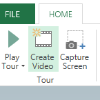
I wasn’t too greedy when size was concerned and just selected a 720p video.
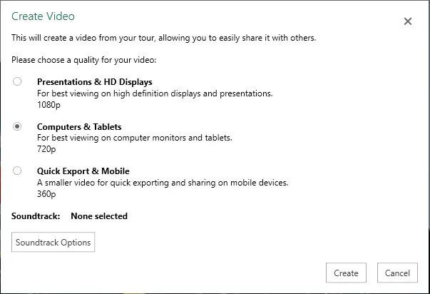
Next I added a soundtrack (just waiting on a lawsuit for that).
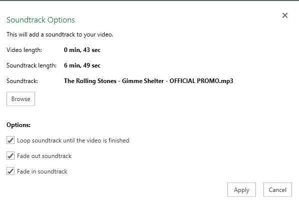
Applied that and clicked Create.

And a few minutes later (when watching the video, take into account that the chart is being created 5 times faster so it does not reflect the background music)…
And now we know, if you are too late to get center stage view, you will see just as much of Mick standing mid left. Further analysis shows that that is because around 2:40 Lisa begins her vocal solo and Mick takes the place of a back-vocalist for just over half a minute. One might also say that the chart would be far more diverse if that part was not there. But the overall analysis shows that you would get a chance to look straight at Mick at some point in the song, no matter where you stand. J. So even Excel proves that Mick Jagger is a great front-man.
After that I even played around with a second layer and a Heat map option.

And I got this
Imagine showing your data like this at the next meeting 🙂 Eternal happiness.
Excel Unplugged acknowledgements


Donate