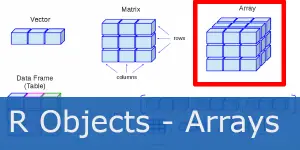
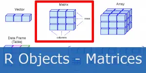
R Beginner Tutorial – Arrays
R Academy Menu ggplot2 basics: learn ggplot2 in 15 minutes!R Beginner TutorialR Beginner Tutorial – Basic SyntaxR Beginner Tutorial – R ObjectsR Beginner Tutorial –
Ggplot2 is the most famous R library for graphics, enabling you to create beautiful print quality and publication-ready data visualizations. If you’re not familiar with R, start with R basics: learn R in 15 minutes!.
It is based on grammar of graphics idea, which basically means each part of code stands for a component or a layer. We add components together using the + sign. Consequently the basic structure of any plot looks like this:
ggplot(data = , aes(x =, y = )) + geom_name()geom_histogram() for histograms
similarly, geom_bar() or geom_col() for bar charts
geom_boxplot() for boxplots
geom_point() for points
geom_line() or geom_path() for lines
and likewise geom_smooth() for trend lines
Let’s look at some examples. You can download the content of this article in the R file here and follow along.
In all examples, we’ll use the R’s famous Iris Dataset, which contains information on Iris plant. It specifies measurements for four features measured for three variants of Iris flower (setosa, virginica, versicolor). All measurements are given in centimeters.
Here is a preview of the Iris Dataset.
> iris
Sepal.Length Sepal.Width Petal.Length Petal.Width Species
1 5.1 3.5 1.4 0.2 setosa
2 4.9 3.0 1.4 0.2 setosa
3 4.7 3.2 1.3 0.2 setosa
4 4.6 3.1 1.5 0.2 setosa
5 5.0 3.6 1.4 0.2 setosa
6 5.4 3.9 1.7 0.4 setosa
7 4.6 3.4 1.4 0.3 setosa
8 5.0 3.4 1.5 0.2 setosa
9 4.4 2.9 1.4 0.2 setosa
10 4.9 3.1 1.5 0.1 setosa
11 5.4 3.7 1.5 0.2 setosa
12 4.8 3.4 1.6 0.2 setosa
Now let us plot a basic Point Plot. We input the iris dataframe as data and assign the Sepal.Length column to x axis and Sepal.Width to y axis.
Add geom_point() to plot the points to the plot.
> library(ggplot2)
> ggplot(iris, aes(x = Sepal.Length, y = Sepal.Width)) + geom_point()

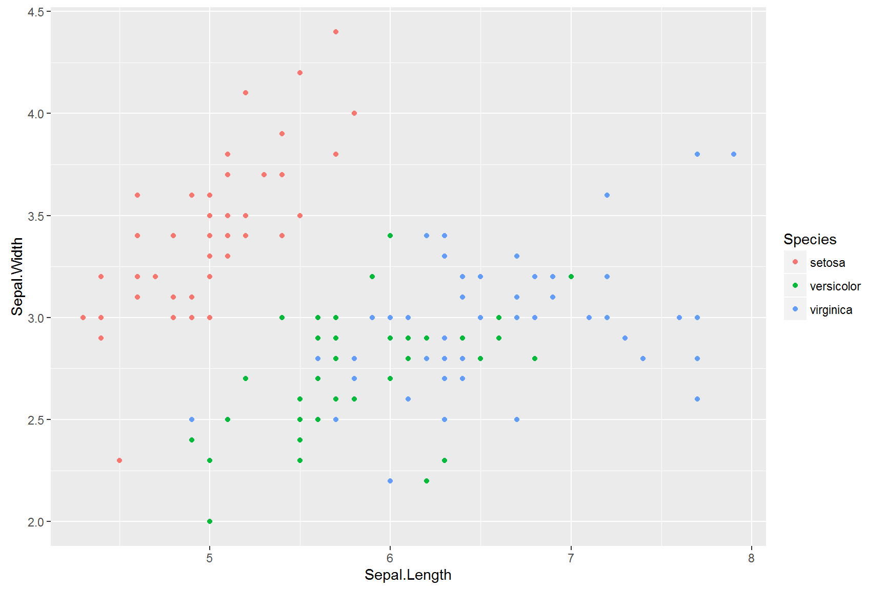
We often want to separate data according to the field in our data. For example let us specify the Species column as our color argument with colour = Species.
> # Add colors to groups
> ggplot(iris, aes(x = Sepal.Length, y = Sepal.Width, colour = Species)) + geom_point()
A histogram organizes a group of data points into ranges and plots the frequency of occurrence within each range. As a result a Histogram is one of the most widely used chart types in Statistics and Analysis.
> ggplot(iris, aes(x = Sepal.Length)) + geom_histogram()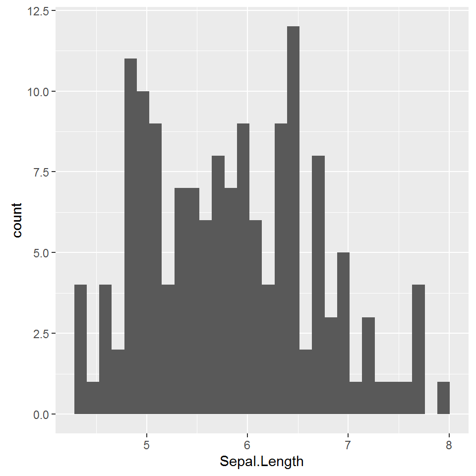
Moreover, if we wanted to color separate the chart by group we specify Species column as our fill argument with fill = Species.
>  # Add colors to groups
> ggplot(iris, aes(x = Sepal.Length, fill = Species)) + geom_histogram()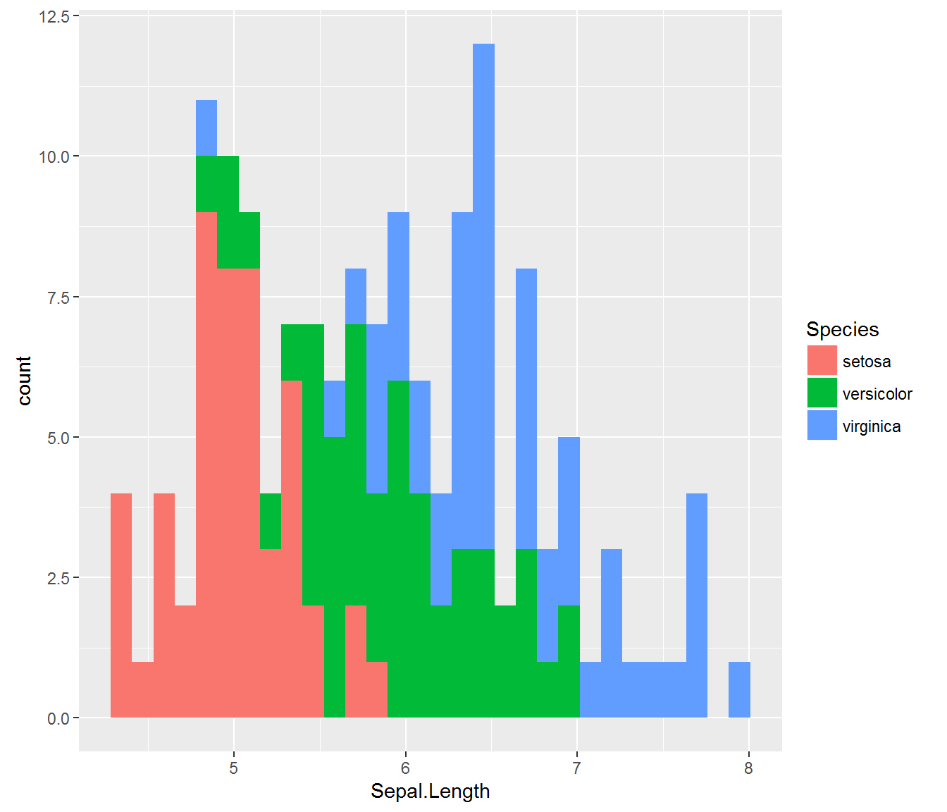
As one of the most important statistical representations of data, the Boxplot illustrates the distribution of data based on descriptive statistics: minimum, first quartile, median, third quartile, and maximum.
> ggplot(iris, aes(x = Species, y = Sepal.Length)) + geom_boxplot()
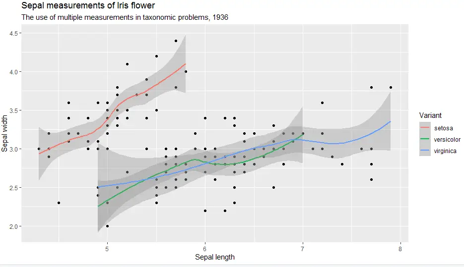
If our data varies widely, it’s very hard to understand a “general direction” the data is taking. Therefore we need a “tool” to visualize the general trend of data. So enter the simple trendline to give us a mathematical description of our data. We get the trendline by adding geom_smooth().
> ggplot(iris, aes(x = Sepal.Length, y = Sepal.Width)) + geom_point() + geom_smooth()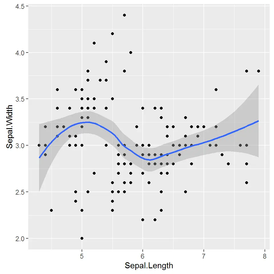
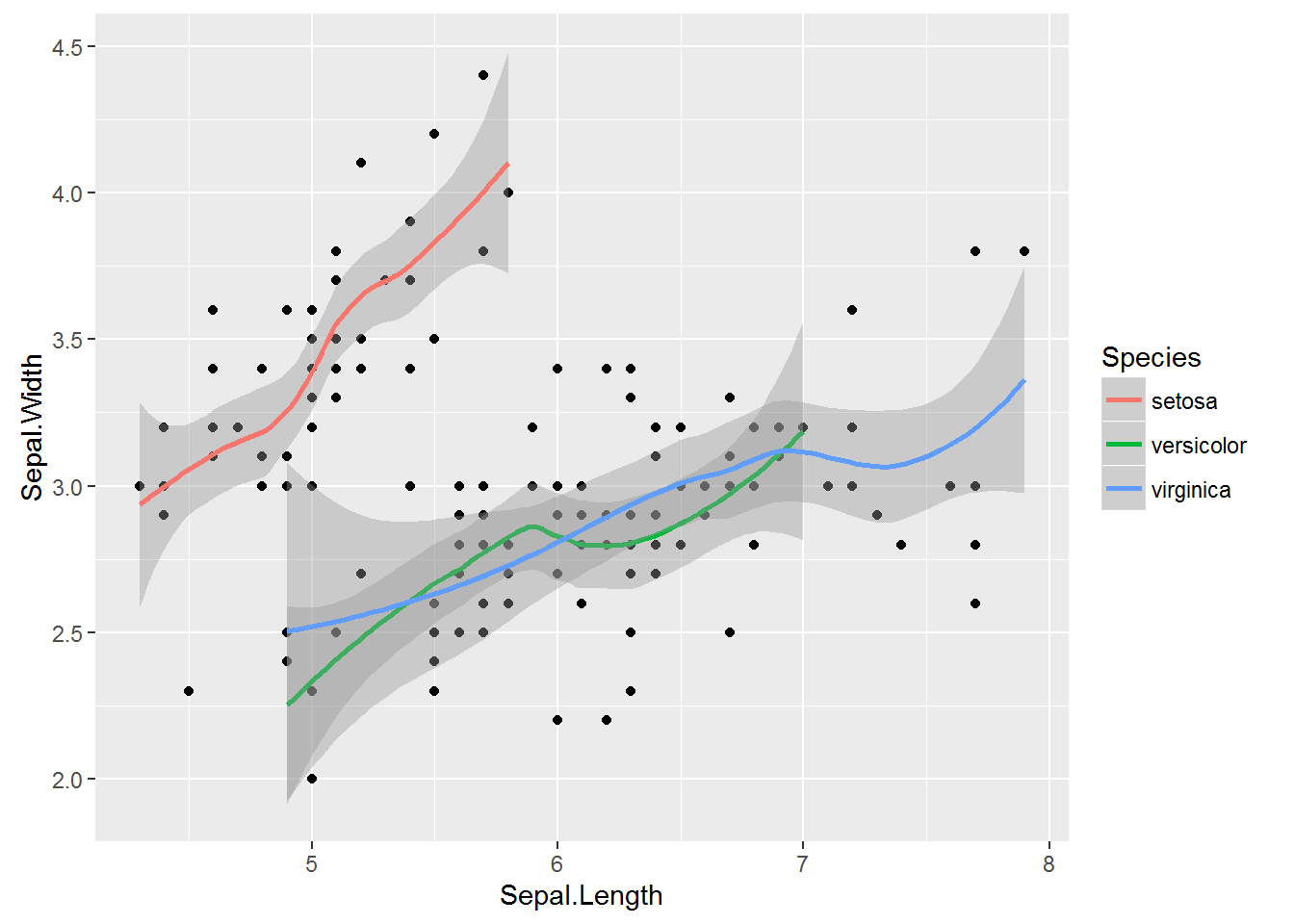
In the same vain as with other plots, we can add color to trendlines. To add trendline by group we specify Species column as our colour argument with colour = Species.
>  # Add trendlines based on groups in Species column
> ggplot(iris, aes(x = Sepal.Length, y = Sepal.Width)) + geom_point() + geom_smooth(aes(colour = Species))
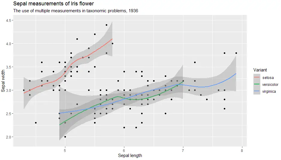
Labels are critical to every plot. In short, to add labels to the plot created in ggplot2 with labs() function.
> ggplot(iris, aes(x = Sepal.Length, y = Sepal.Width)) +
geom_point() +
geom_smooth(aes(colour = Species)) +
  labs(
    title = "Sepal measurements of Iris flower",
    subtitle = "The use of multiple measurements in taxonomic problems, 1936",
    x = "Sepal length",
    y = "Sepal width",
    color = "Variant")
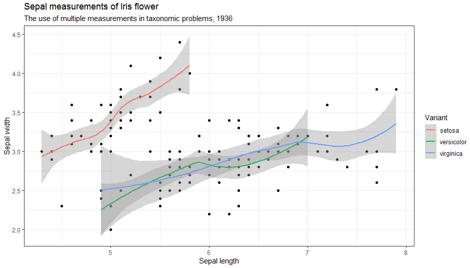
Add theme to change look of the plot. Some of the most popular themes are: theme_classic(),
theme_bw(), theme_minimal(), theme_gray().
Firstly, let’s look at theme classic.
> ggplot(iris, aes(x = Sepal.Length, y = Sepal.Width)) +
  geom_point() +
  geom_smooth(aes(colour = Species)) +
  labs(
    title = "Sepal measurements of Iris flower",
    subtitle = "The use of multiple measurements in taxonomic problems, 1936",
    x = "Sepal length",
    y = "Sepal width",
    color = "Variant") +
    theme_classic()

Secondly, here is theme bw.
> ggplot(iris, aes(x = Sepal.Length, y = Sepal.Width)) +
  geom_point() +
  geom_smooth(aes(colour = Species)) +
  labs(
    title = "Sepal measurements of Iris flower",
    subtitle = "The use of multiple measurements in taxonomic problems, 1936",
    x = "Sepal length",
    y = "Sepal width",
    color = "Variant") +
  theme_bw()
Further, here is theme minimal.
> ggplot(iris, aes(x = Sepal.Length, y = Sepal.Width)) +
  geom_point() +
  geom_smooth(aes(colour = Species)) +
  labs(
    title = "Sepal measurements of Iris flower",
    subtitle = "The use of multiple measurements in taxonomic problems, 1936",
    x = "Sepal length",
    y = "Sepal width",
    color = "Variant") +
  theme_minimal()

And last but not least here is theme gray.
> ggplot(iris, aes(x = Sepal.Length, y = Sepal.Width)) +
  geom_point() +
  geom_smooth(aes(colour = Species)) +
  labs(
    title = "Sepal measurements of Iris flower",
    subtitle = "The use of multiple measurements in taxonomic problems, 1936",
    x = "Sepal length",
    y = "Sepal width",
    color = "Variant") +
  theme_gray()
In short, themes are great as they allow us to have a uniform look throughout our reports.
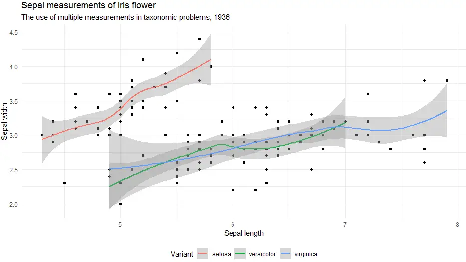
Certainly, the ability to change the position of the legend within a theme is something we will often use. Therefore here is an example.
> ggplot(iris, aes(x = Sepal.Length, y = Sepal.Width)) +
  geom_point() +
  geom_smooth(aes(colour = Species)) +
  labs(
    title = "Sepal measurements of Iris flower",
    subtitle = "The use of multiple measurements in taxonomic problems, 1936",
    x = "Sepal length",
    y = "Sepal width",
    color = "Variant") +
  theme_minimal() +
  theme(legend.position = "bottom")
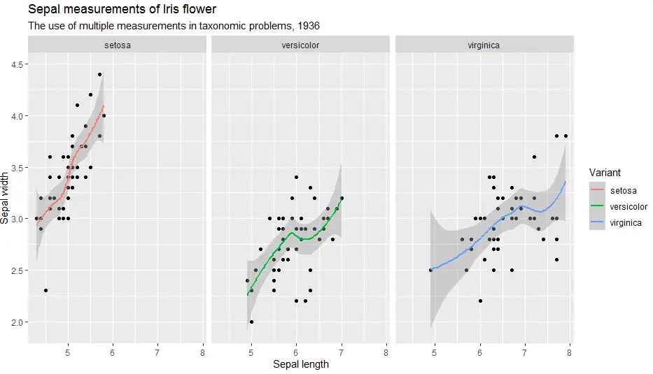
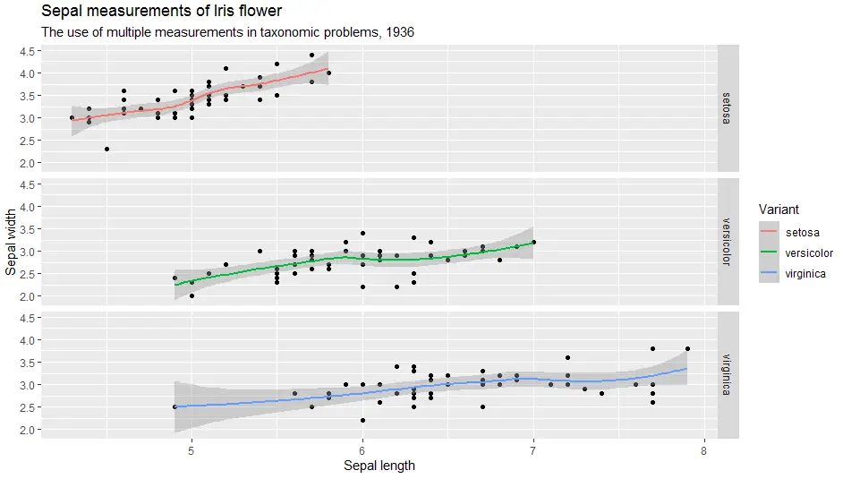
Ggplot2 can neatly arrange our plot into smaller facets or small multiples. Functions we use are called facet_wrap() and facet_grid().
facet_wrap() is used to show a different plot for each level of a single variable.
facet_grid() is used to show all intersection plots of two variables.
> ggplot(iris, aes(x = Sepal.Length, y = Sepal.Width)) +
  geom_point() +
  geom_smooth(aes(colour = Species)) +
  labs(
    title = "Sepal measurements of Iris flower",
    subtitle = "The use of multiple measurements in taxonomic problems, 1936",
    x = "Sepal length",
    y = "Sepal width",
    color = "Variant") +
  facet_wrap(facets = ~Species)
> ggplot(iris, aes(x = Sepal.Length, y = Sepal.Width)) +
  geom_point() +
  geom_smooth(aes(colour = Species)) +
  labs(
    title = "Sepal measurements of Iris flower",
    subtitle = "The use of multiple measurements in taxonomic problems, 1936",
    x = "Sepal length",
    y = "Sepal width",
    color = "Variant") +
  facet_grid(Species ~ .)
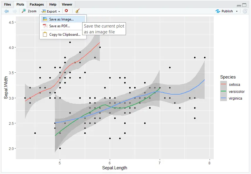
Plots can be saved as image or PDF directly in plot viewer by selecting Export > Save as Image or Save as PDF.
Alternatively, you can use function ggsave(filename, path). For example:
> ggsave(filename = "my_ggplot.png", path = "C:/temp")
If path argument is omitted, it will default to current working directory.
This was a quick overview of ggplot2 basics. To learn more, stand by for our upcoming R course where we’ll go in depth and cover all the relevant topics of R language.

R Academy Menu ggplot2 basics: learn ggplot2 in 15 minutes!R Beginner TutorialR Beginner Tutorial – Basic SyntaxR Beginner Tutorial – R ObjectsR Beginner Tutorial –
R Academy Menu ggplot2 basics: learn ggplot2 in 15 minutes!R Beginner TutorialR Beginner Tutorial – Basic SyntaxR Beginner Tutorial – R ObjectsR Beginner Tutorial –
R Academy Menu ggplot2 basics: learn ggplot2 in 15 minutes!R Beginner TutorialR Beginner Tutorial – Basic SyntaxR Beginner Tutorial – R ObjectsR Beginner Tutorial –
R Academy Menu ggplot2 basics: learn ggplot2 in 15 minutes! R Beginner Tutorial R Beginner Tutorial – Basic Syntax R Beginner Tutorial – R Objects