Option Button Control on the Developer Tab, Top Bottom 5 in Pivot Table and CHOOSE Function in Excel

We have a dish where I come from (Slovenia), called Minestrone. It’s interesting since there is no single recipe for it. It’s made from whatever vegetables are in season or most of the time whatever you have in your fridge. Now when you’re reading the title of this post, you might imagine this post will explain three completely unrelated tools in Excel, but it’s actually a Minestrone made from all three, to create something extremely beautiful and awe-inspiring in Excel. Any dashboard made in Excel will benefit from this post or better yet the tools described in this post.

The picture above shows us where the train is heading. We start with random data which in this sample is nothing but random numbers belonging to specific months. Next up, we will create two radio buttons that will enable us to choose either Top 5 or Bottom 5. This will be followed by the linked cell which will reflect our choice. Then we will create two simple Pivot Tables where we will use the Filter and Top 5 and Bottom 5 options. After this we will put it all together with the CHOOSE function and get the end result.
You can follow the sample with this file where the “Base” Sheet gives you the opportunity to work along. The desired result can be visible on the “End Result” Sheet.
DeveloperTab-Pivot-Choose xlsx Sample
Be careful to have calculation options set to Automatic!
Also, if you find some images hard to view, here is a PDF of the post where the images are clearly visible.
So let’s kick things off with the two radio buttons.
Option Button Control
To create the two radio button controls, we must first enable the Developer Tab in Excel.

If you cannot see this tab, this is how you enable it. You right click any tab name (Home, Insert,…) and choose Customize the Ribbon.
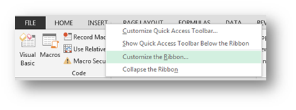
In the Customize Ribbon portion of Excel Options you have to make sure that the Developer Tab is active.

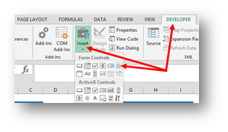
Now for the Button Controls. Select the Developer tab, the Insert command and choose the Radio Button from the Form Controls…
And draw out the control at the desired location. Don’t try to be precise since you can move it around later. You will get

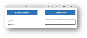
Now you can start positioning it more precisely and changing the text to Top 5 (the screen updating can be very sketchy when you are changing or inserting a label), and then do the most important thing. Connect this control with cell K6. You can achieve this by right clicking on a button and choosing Format Control.

In the dialog box that appears, on the Control tab, you show the control which Cell should reflect your choice. I chose K6.

After confirming this with OK, the linked Cell should read 1. Now you could go through the whole process again to create a Bottom 5 Option Control, or you could just copy the first one and change the label to Bottom 5 (again, screen updating can throw you off, don’t let it!). Now as you go back and forth between the two controls, the linked cell should switch between 1 and 2.
Next, we turn our attention to the Pivot Tables.
Top and Bottom 5 with Pivot Tables

To produce the two pivot tables, we will first create the simplest of Pivot Tables from our data.
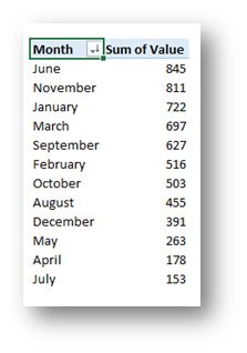
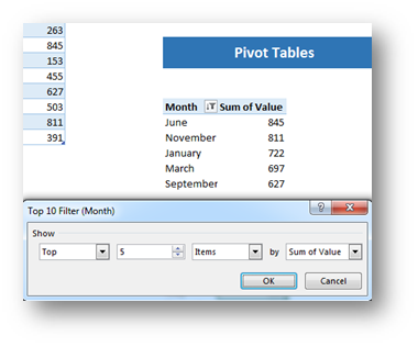
Next we will choose the Top 10 from the Pivot Table Filter list in the Month names.

Since we only want the Top 5, we will fill the dialog box as follows…
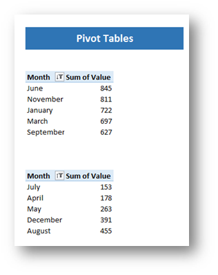
What we also did is we sorted the Top 5 Pivot Table in Descending order.

Then we create a copy of the first Pivot Table and paste it underneath. Here we set the filter to Bottom 5 items and set up the ascending sort order. At this point we have
Now everything is set up for the final stage.
The CHOSE function in Excel
CHOOSE is a very simple functions that replaces about 253 IF functions :). The syntax of CHOOSE is
=CHOOSE(Index Number,Value1,Value2,Value3,…)
The simplest sample would be
=CHOOSE(1,12,5) gives 12
=CHOOSE(2,12,5) gives 5
So first you have a number between one and the number of Values or formulas behind it. The number in the first argument tells the CHOOSE function which Value to return. Now we will use it like so…
=CHOOSE( look in cell K9 to see whether I wish to show the Top 5 or Bottom 5 (1 or 2), under one we will return a cell within the first Pivot table , under two a cell from the second Pivot Table)
Here are the formulas
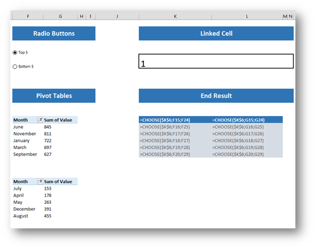
And here are the results

Once again. here is a sample file.
If you find some images hard to view, here is a PDF of the post where the images are clearly visible.
Now this truly takes us one step closer to eternal happiness.
PS: it should also be said that in a Dashboard scenario only the Radio Buttons and the End Result portion of the solution would be visible on the Dashboard itself. Other parts including the Linked Cell would be on a hidden Sheet in the same Excel Workbook.
Related Posts

- January 20, 2015
A while back I wrote about multiple ways to get quarters from ...
Excel Unplugged acknowledgements


Donate