AI in Excel – Part 3 – Analyze Data, the Future of Data Analysis?
- Gašper Kamenšek
- January 6, 2022
- 0 Comments

Welcome back to Artificial Intelligence in Excel! In Part 1, we looked at a feature called Flash Fill. It works by recognizing patterns of data and filling out the remainder. In Part 2, we introduced Power Query’s Column From Examples command. It’s similar to Flash Fill. It fills in the rows based on the input we provide. However, it has a great advantage over Flash Fill, It’s dynamic. If the input data changes, the filled-in data changes too! In Part 3, we’ll get to know Analyze Data. It’s a powerful feature that provides high-level summaries, visuals in the form of different charts that show trends and patterns. And as far as AI goes, this is as close as you can get in Excel (right now).
Let’s see how it works.
Analyze Data
To follow along, you can find the corresponding data in the file here.
Make sure to select the last sheet, True AI.
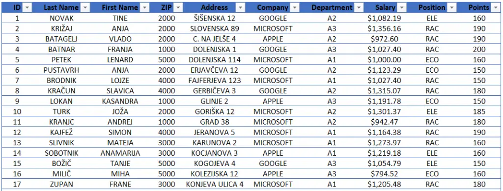
Let’s start with a table of employees from different companies.
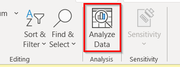
After selecting a cell in a table, click Analyze Data in the Analysis group.
After a few moments, a side panel pops up on the right. It contains a plethora of summaries and visuals.
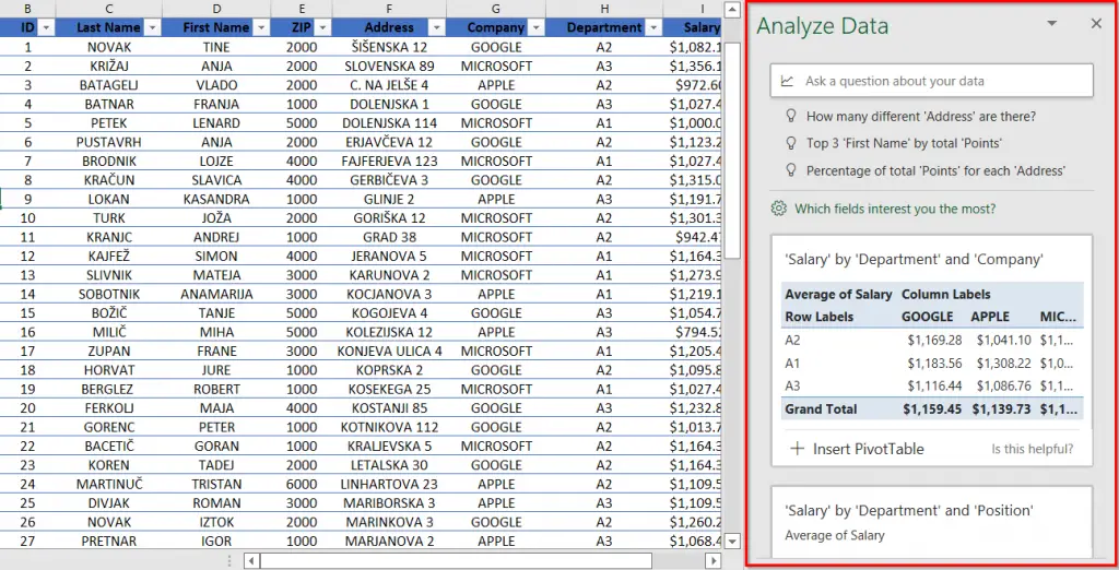
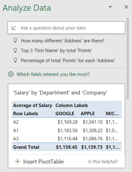
Let’s go through the first few insights. The first one tells us the average salary by department and company, definitely a very informative pivot table.
Second is a chart of salary by department and position, another very useful insight.
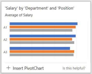
Under every insight, there is an insert button, for example, Insert PivotChart, Insert Chart, and Insert Pivot Table. Let’s try to insert the chart from the image above. We get the following result. A pivot table is conveniently printed out next to the chart.

The third insight is a histogram showing the frequency of salary, again very useful information.
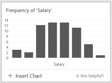
The next one is brilliant, a chart showing outliers in the Points-Salary relationship. We can see there are four points identified as outliers, colored orange on the chart. Imagine how much work you would need to do yourself just for this one conclusion!

There are many more insights available (29, as seen on the image above) and we can readily browse through and pick out the ones that serve us best.
Asking questions with Q&A
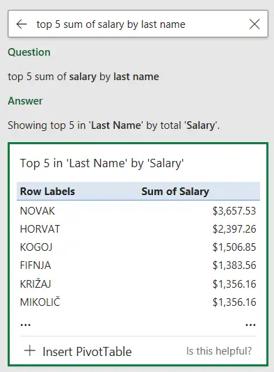
In addition to a number of generated insights, we can ask questions using the Q&A bar at the top. For example, let’s get the top 5 employees by salary. Type in top 5 sum of salary by last name.
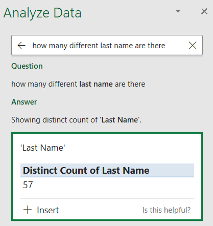
Or, we can check how many different last names are there on our table.
Also, we can get the most common first name.

Conclusion
Analyze Data is a very real piece of artificial intelligence in Excel. It begs a question: does the person now become redundant? Is AI coming for our jobs? I really don’t think so. We still have to interpret the insights ourselves to see which ones actually make sense and are most useful to us. Analyze Data just makes our jobs a whole lot easier, and when was that ever a bad thing?
Watch the tutorial
Meanwhile, you can also watch the tutorial online on our YouTube channel!
Please leave us a like, comment, and subscribe for more amazing Excel tricks!
Follow us on LinkedIn.
Check out our brand new R Academy!


