Add data to your Chart (the easy way)
(as simple as Copy and Paste)
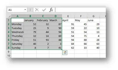
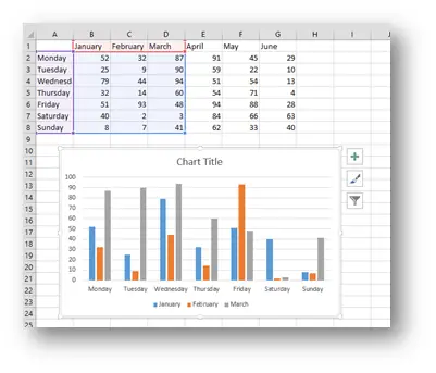
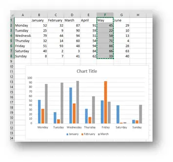
This is our sample data. First we select the data for all days but only for the first three months and press Alt + F1. That is the best Chart Shortcut you can know. Whereas in Excel 2003 both F11 (which creates the chart on its own sheet then and now) and Alt + F1 did exactly the same, since Excel 2007 Alt + F1 creates the default chart on the same sheet next to your data. So we get this.
Now we wish to add the May column to our chart. Now many may know the “just stretch the blue rectangle to the desired column method”,
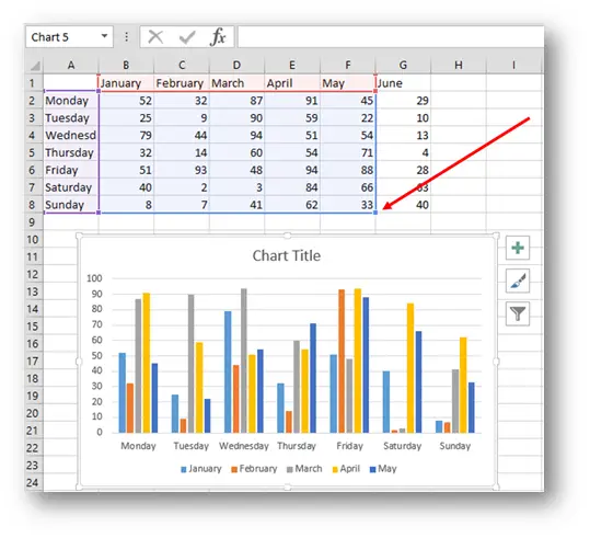
but you cannot add the May column without adding April.
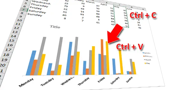
But guess what. You can do this even faster. All you have to do is to select the data you want to add and press Ctrl + C (Copy).
Now select the Chart and simply press Ctrl + V (Paste).
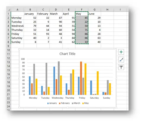
And that is it. As the subtitle promised, as simple as Copy and Paste J, you simply paste the new data into your Chart.
Related Posts

- May 26, 2015
Up to Excel 2016, if you wanted to create advanced and special ...

- December 28, 2014
This is what happens when someone has too much time and Excel ...

- December 2, 2014
Just so we know where this is heading, this is the end result And ...
Excel Unplugged acknowledgements


Donate