Making your Min Max chart in Excel truly shine
- Gašper Kamenšek
- December 2, 2014
- 4 Comments

Just so we know where this is heading, this is the end result
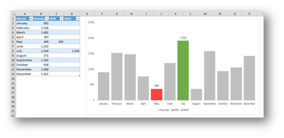
And here is the file with the end result, you can download it and play around with pressing F9.
Here’s how we make it work.
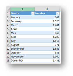
We start with the data. Now we need to add two columns that will only show the min or max value and have blanks on other occasions.
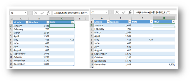
The two formulas will be
MIN: =IF(B2=MIN($B$2:$B$13),B2,””) or if you write a table formula
MIN(Table): =IF([@Number]=MIN([Number]),[@Number],””)
MAX: =IF(B2=MAX($B$2:$B$13),B2,””) or if you write a table formula
MAX(Table): =IF([@Number]=MAX([Number]),[@Number],””)
Now we create a basic Column Chart from this data and we get

The order of the series is important, it should be
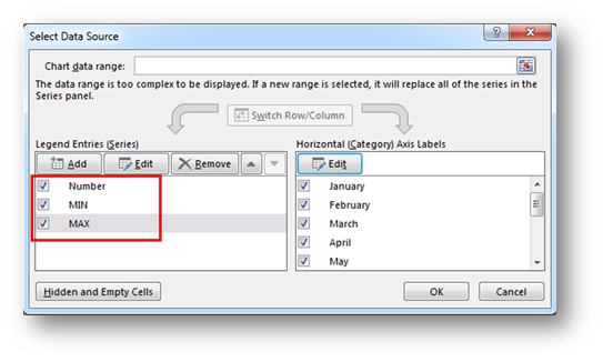
The first thing we need to do is to change colors of the MIN and MAX series.
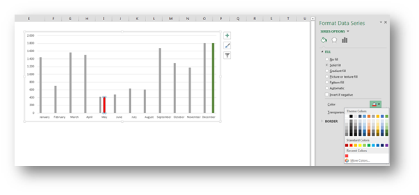
Next, we change the Overlap and Gap Width properties of any series so that the columns overlap and are wider.

Now this is a personal preference but I also removed the gridlines.

Afterward we add the data labels for the MIN and MAX series

And
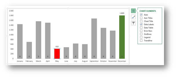
Now all that stands in our way as we stride towards eternal happiness is those zero values at the bottom. We will sort them out by fixing the MIN and MAX series Number format
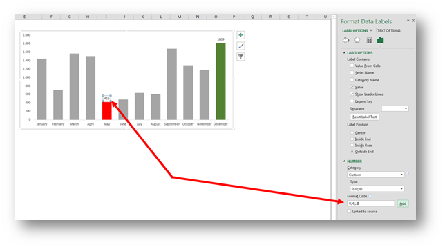
We change that into
0;-0;;@
And press Add. After we do this for both the MIN and the MAX series, all the zero values disappear. Further explanation of this format can be found in the Custom Cell Format You Must Know post.
You can hide the MIN and Max columns in the data table and the chart will be even more inspiring.

Related Posts
- May 26, 2015
Up to Excel 2016, if you wanted to create advanced and special ...
- April 7, 2015
(as simple as Copy and Paste) This is our sample data. First we ...
- December 28, 2014
This is what happens when someone has too much time and Excel ...

