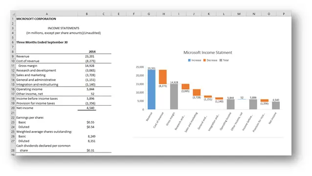
Up to Excel 2016, if you wanted to create advanced and special charts, your best option was Jon Peltier. He created great Excel charting add-ins. My favorite is the advanced edition of his charting utility. Now there are still many things and fine-tuning that you can only do if you have that add-In but with Excel 2016, quite a few new charting options are available.
It’s been a long time coming and I’m guessing the biggest wish that users had when it comes to charting. And now, in Excel 2016 you will be able to create your own waterfall charts with one click.
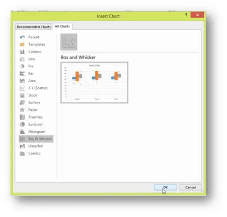
Every time you have data that is distributed, as the Schools results by courses are bellow.
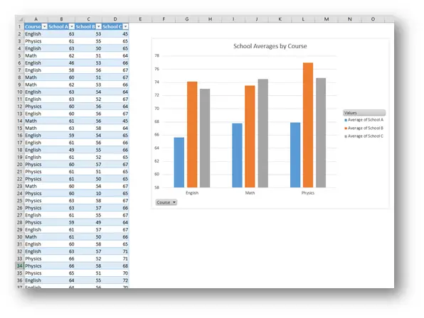
You can show that distribution with a Box & Whisker Chart.
Brilliant right? But the last one is even greater.
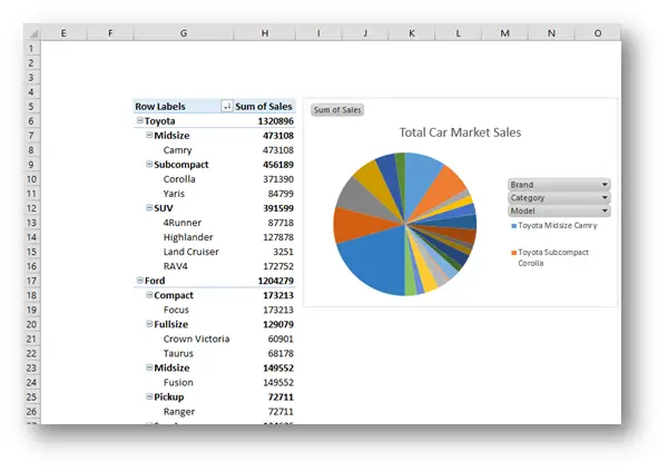
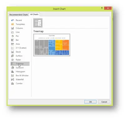
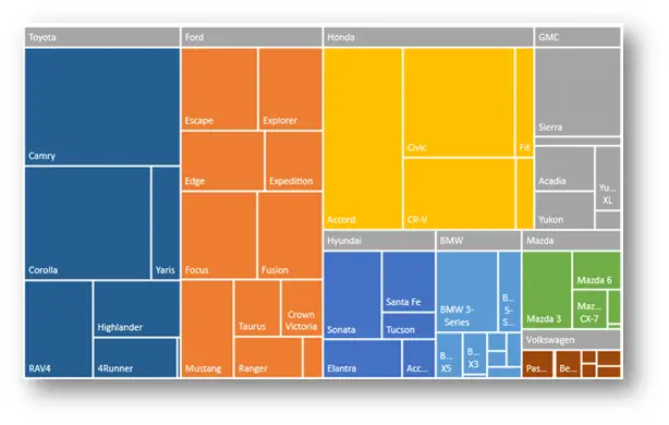
Showing data over many hierarchies is never easy and up to now, not many options were available in Excel but now, for just a few levels of hierarchy, a Treemap is a perfect chart for that.
But it gets even better.
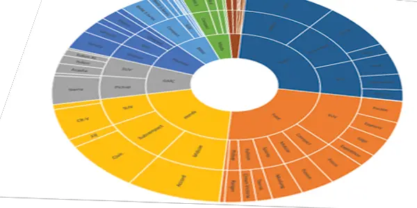
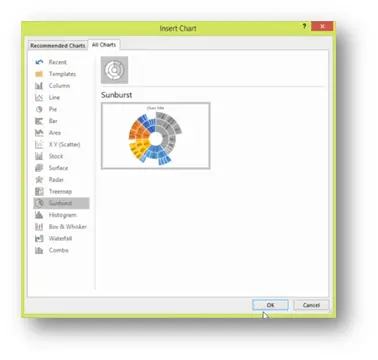
This is my favorite charting option in Excel 2016. Able to show much more levels, here is Sunburst.
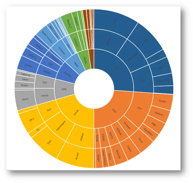
Now this really takes any Data Analyst or Dashboard designer one step closer to eternal happiness 🙂
Check out our YouTube channel and subscribe for more amazing Excel tricks!
Follow us on LinkedIn.
Check out our brand new R Academy!
(as simple as Copy and Paste) This is our sample data. First we ...
This is what happens when someone has too much time and Excel ...
Just so we know where this is heading, this is the end result And ...
This site uses Akismet to reduce spam. Learn how your comment data is processed.
Hi Gašper. Great post!
I am wondering that this charts are only available in some versions of the new Excel 2016. Am I right?
I am actually using the Home Premium version of Excel 2016 (I have an Office 365 account), and for me these new charts aren´t available.
Thank you!
Raphael
Hi,
they are just not a part of a public preview versions yet. I’ve gotten to see and use them at the Excel Amsterdam Summit and when I was talking about Excel 2016 at our local Microsoft Conference. They will become public shortly and then they will be available in all versions of Excel 2016.
Ah, that explains why I can’t find them. Do you have any idea when they might come available?
Hi,
the word from Microsoft is that it’s in the latest build, so the build currently available should contain the new charting options.
Hi Gašper,
Thank you for sharing! It is really cool to know that the charts will be available soon 🙂
Gašper, c’mon! you’re teasing us!
I’m sitting here on the patio of a bar, having a beer. I stopped. Pulled out my laptop. Generated some dummy data in Excel … no tree charts. YET.
… and my beer is warm now. You owe me $4.
@Oz – sorry man, if or when you come to Slovenia, I will buy you one of them great beers we have in Slovenia 🙂 I do love the enthusiasm although 🙂
Yes! I have to get to Slovenia.
I’m looking forward to these new charts. This is going to be really good because it’ll help Excel users do some of the things that hardcore coders are doing. And I can envision some really cool infograms built from the new charts.
Hi,
yes, now there is the waterfall chart in Excel 2016, but I couldn’t make the last “total” column on the chart like in your example/screen 4 540
🙂
My fault
right click and “set as total”
I like the extended menu of charts. However, my wishes are more modest. I want to be able to input not only a value but also a formula as the maximum value in the Y axis of a Scatter chart. Can I do this in 2016 version? Many thanks, Rodolfo
PS: When I plot a line whose highest point is 10, the Y axis will extend to 11 or 12 or 15 depending on the Major Unit. In addition, many times, I want the minimum value to be greater than 0, Excel´s default.
The charts are finally available!!!
Are these charts commonly available on Excel 2016 now? I have just installed the whole suite, singed in, but the chart types are not shown. I downloaded the sample data from the office blog on its new charts – when I open it the chart box has the message that this chart type is not available in this version of Excel.
Thanks for any advice.
As far as I know, all full Office 2016 versions include this charts so could it be that it’s not Office 2016?
Hi Gaspar –
I am told my the MS Excel 2016 community that they have not yet been included. Awaiting further updates.
Best regards, Ric
Box Whisker chart adds a visual angle to Excel’s statistical functionality, creating a simple snapshot view of the data’s characteristics.
Hi All,
I was wondering if we can generate the Treemap, Sunbust, Histogram Etc chart from Power Pivot Excel 2016?
Thank you!
Regards
Sohail
Since you can only create a Pivot Table from Power Pivot Data, and both charts you mention cannot be created with the Pivot Table being the source, the answer is sadly no… But you can do a bit of magic with Power Query (Get & Transform) where you create a Pivot Table from Power Pivot and then pull it into Power Query and transform it as you desire, then drop it in as a regular table…
This will give you the refresh capabilities that you desire and seamlessly create a chart on Power Pivot Data.
Where can I go to download this chart package
This charts are not a part of some package that you can download, they are built into Excel 2016. So if you have Excel 2016, then these new charts are available.