My three favorite things in Excel 2016
- Gašper Kamenšek
- May 12, 2015
- 5 Comments
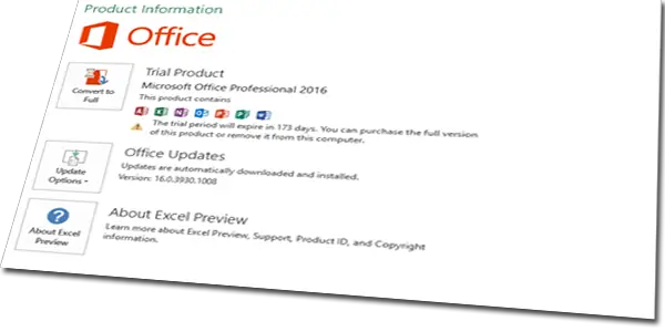
First off, this post is written on basis of a public preview of Office 2016 which you can get here. The official version will contain a few more goodies like many new charts including Waterfall Chart… But as I said, this is what can be seen in the preview.

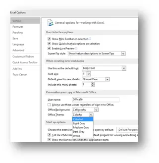
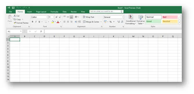
Let’s kick things off with one that didn’t make my list but just seems to light up peoples eyes when I show it to them. The new office comes in color J. So not just white, and the two shades of gray like in 2013 (now there are tree shades of gray, so still not fifty but one more), but now you also have a setting called colorful.
And this is what you get
Now for my three favorite things.
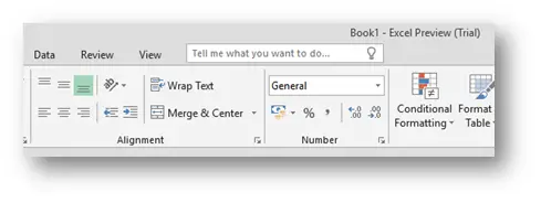
Tell me what you want to do…
Now this is something you will see not only in Excel but also in Word and PowerPoint. It’s basically a Search Box that lets you find the commands you need.
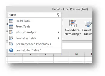
So if you write table you get the most common commands used with tables.
But you can also use it as the name suggests. You say what you want to do, and you get the commands that allow you to do that. If for instance you want to change the font, you write change font and you get

Quite brilliant.
Power Query
Ok now those of you that are regular readers of Excel Unplugged know that Power Query is in my opinion the greatest thing that came with Excel 2013 and if you read any of my posts on this subject (post 1, post 2 and post 3…), then you know how unbelievable this data import tool is. But up to now, this was an Excel Add-In that you had to install separately and only worked with PowerPivot in Excel Professional Plus which was also a drawback. But now, it’s native to Excel! This means, you can find it on DATA/PowerQuery.
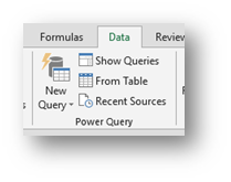
And all the commands are there.
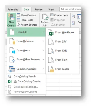
But what this also means is that Power Query will now be in all versions of Office 2016!
Forecast Sheet

The third new thing I picked will help you immensely when you have data that you can tie to a timeline. After that, you might want to forecast the future of your data and DATA/Forecast Sheet will help you with that. It’s quite easy to use. You select your data and select the command.

Afterwards you get the Create Forecast Worksheet dialog box that gives you quite a few options but the main one that effects the forecast is the seasonality of your data. Now since the data above is a random set, the command will not detect the seasonality automatically, but you can manually set it to 12 (since this is monthly data). The second image bellow shows you the difference.
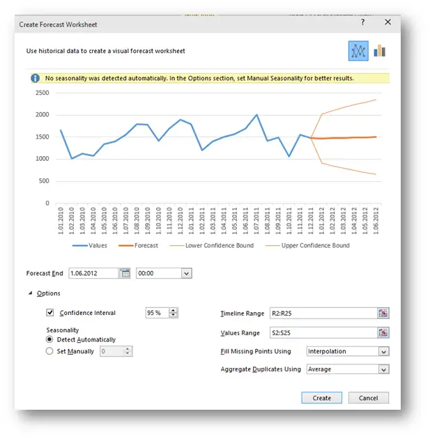

Now you press Create and get a new sheet with the chart above but also with the data table providing you all the data for the chart.
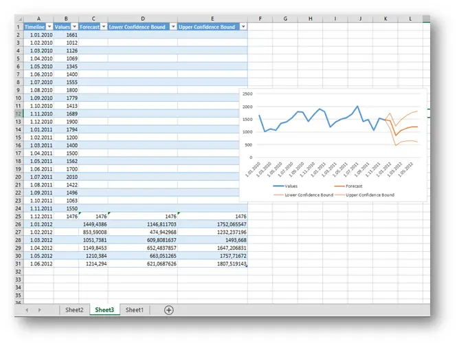
A wonderful thing by itself but it also allows you to fiddle around with different settings and get it exactly to your liking.
I hope this post got you as excited about the new Excel 2016 as I am!
Related Posts
- May 26, 2015
Up to Excel 2016, if you wanted to create advanced and special ...

